
Dashboard Design Services
Most dashboards show everything available and answer nothing. A good one starts from the decisions its users make and shows only what changes them — which usually means less on screen, not more.
Discuss your dashboard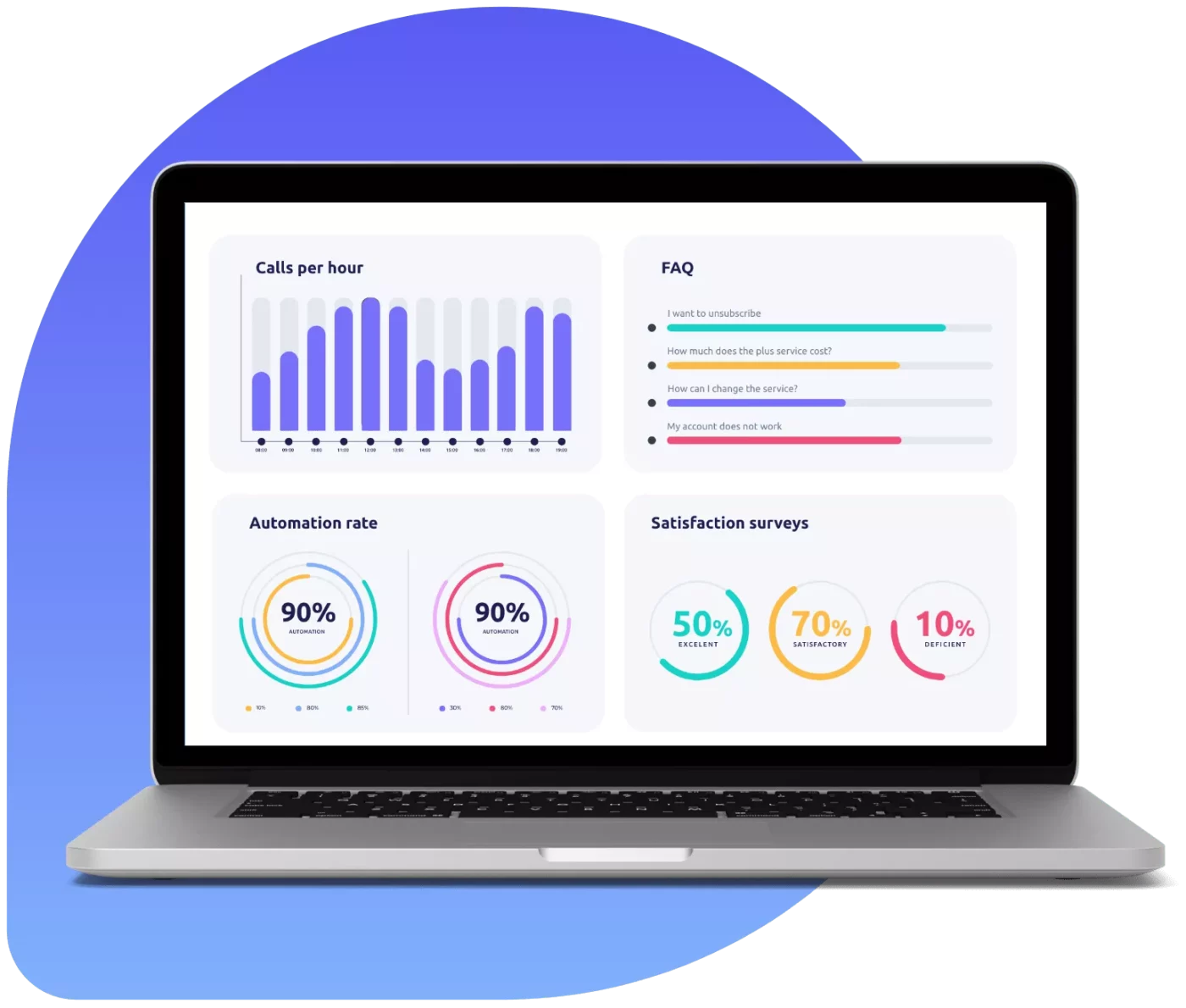
What We Design
Different audiences need genuinely different dashboards.
Executive Dashboards
A handful of metrics with trend and context, answering how the business is doing at a glance.
Operational Dashboards
Live monitoring for teams who watch them all day, designed for peripheral vision and fast anomaly spotting.
Analytical Dashboards
Exploration tools with filtering and drill-down for people whose job is to dig into the numbers.
Customer-Facing Analytics
Reporting inside your product, where the design has to work for people who are not analysts.
Chart Component Systems
A reusable visualisation library so every chart in your product behaves consistently.
Dashboard Redesign
Fixing existing dashboards that people avoid, usually by removing far more than we add.
Design Principles We Apply

Context on every metric
A number alone means nothing — trend, target and comparison make it actionable.
Accessible colour
Palettes that survive colour-blindness and greyscale printing, with meaning never carried by colour alone.
Loading and empty states
Skeletons and honest empty states, because real dashboards wait for queries.
Responsive behaviour
A considered mobile view rather than a desktop grid squeezed onto a phone.
Export and sharing
Export, scheduled reports and shareable views, which is how dashboards actually get used in meetings.
Filters that persist
Filter state remembered and shareable by URL, so returning users do not start over.
Who We Design For
Products with real complexity — where the design job is deciding what goes on the screen, not decorating what is already there.
Talk to our teamDesign Capabilities Beyond The Screens
What makes a design usable by developers and durable as the product grows.
Design systems
Documented components, variants and tokens rather than a folder of finished screens.
Tokens in code
Colour, spacing and type exported in a form engineering consumes directly.
Every state designed
Empty, loading, error and edge cases handed over with the happy path.
Accessibility
Contrast, focus order, target sizes and screen reader behaviour checked during design.
User research
Interviews and usability testing, so decisions come from evidence rather than internal debate.
Build review
We review the implemented interface against the design and log the differences.
How We Work
Interviews first — dashboards designed without talking to users are always wrong.
Interview users
What decisions they make, what they check first, what they currently export to a spreadsheet.
Structure
Metric hierarchy and layout agreed before visual design.
Design
Charts, states and interactions designed against real data volumes.
Test and refine
Reviewed with real users on real data, then adjusted.
Design A Dashboard People Open
Tell us who uses it and what they decide. We will design around those decisions rather than around the data you happen to have.
Talk to our design teamDashboard Questions
Everything you need to know about our design work.